


Theme switching stopped being a design nicety and became a baseline expectation. Every operating system lets a user state a light or dark preference, and the modern CSS to honor it costs almost nothing. The same collapse in cost is why it is now an accessibility job, and most teams are shipping it as a color-inversion pass instead.
Two things are true at once here. Supporting a theme is nearly free if you use the right primitives, and doing it accessibly is harder than it looks, because the accessibility rules apply independently to every theme you ship. The teams that treat dark mode as a design toggle get the first half and fail the second. This article is the full picture: what the research actually shows about who benefits, the three-primitive CSS stack, the token-first way to build it, and the contrast and forced-colors audits that make it accessible.
What the evidence says about who actually uses it
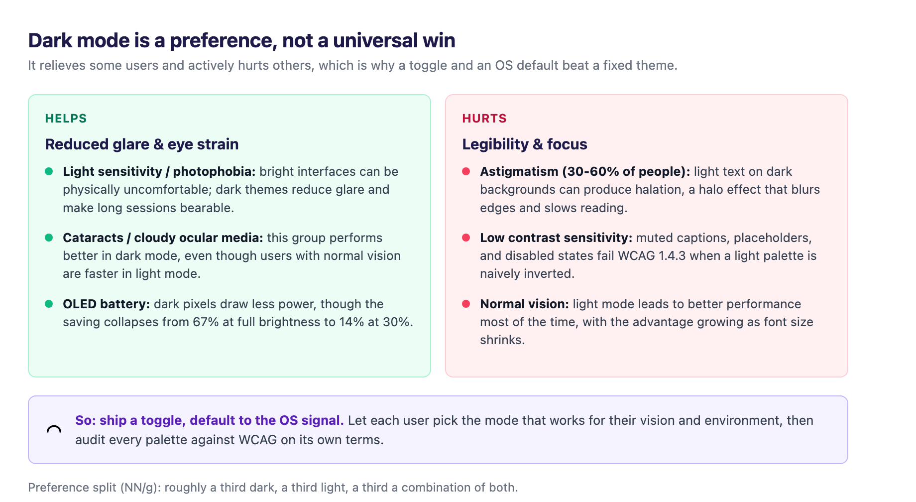
Start with the honest data, because a lot of the dark-mode pitch is folklore. Nielsen Norman Group surveyed 115 mobile users about the mode their device was generally in: roughly a third said dark mode, a third said light mode, and a third said a combination of both1. So dark mode is popular, but it is not a universal preference, and it is heavily contextual, varying with ambient light, task, and session length1.
The reason people cite is where the myth lives. Reduced eye strain is the most common justification, yet controlled research has failed to find a significant difference in reported eye strain or headaches when people complete the same tasks in light and dark mode1. The battery-saving claim is real but narrow: dark mode saves power only on OLED displays, and a Purdue study found the savings averaged 67 percent at 100 percent screen brightness but dropped to 14 percent at 30 percent brightness1. Brightness matters as much as the mode. And in users with normal vision, light mode leads to better performance most of the time, with the advantage growing as font size shrinks2.
The nuance cuts the other way for specific groups. People with light sensitivity, photophobia, or migraines can find bright interfaces physically uncomfortable, and a well-calibrated dark theme reduces glare and makes long sessions more bearable3. Users with cataracts or cloudy ocular media perform better in dark mode, per the same body of research that found light mode faster for users with normal vision2.
Then there is the group that dark mode actively hurts. Astigmatism affects an estimated 30 to 60 percent of people, and for them light text on a dark background can produce halation, a glowing halo effect around characters that blurs edges and slows reading3. The guidance is blunt about the consequences: for some users, dark mode compromises readability even though it is celebrated as a relief for others3.
The takeaway is a design rule, not a hedge. Dark mode is not inherently accessible and not inherently better. It is a preference some users need and others cannot tolerate, so you ship a toggle, default to respecting the OS signal, and audit every theme on its own.
The CSS stack that made theming nearly free
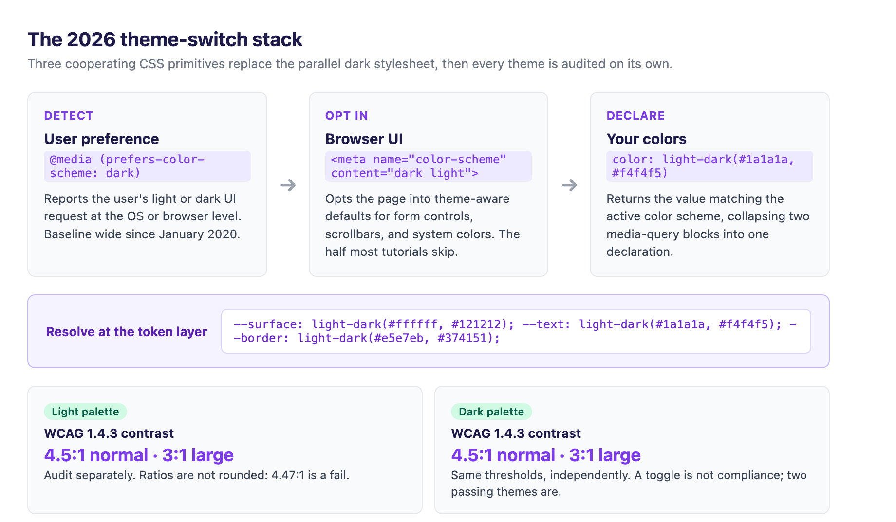
The reason theme support is cheap in 2026 is that the implementation collapsed to three cooperating primitives, each with a distinct job2.
The first detects the preference. prefers-color-scheme is a media feature that reports whether the user requested a light or dark UI at the OS or browser level, and it has had baseline wide availability since January 20202.
The second opts the page in. A color-scheme meta tag tells the browser's user-agent stylesheet to use its theme-specific defaults for form controls, scrollbars, and CSS system colors. The recommended form is the meta tag rather than the CSS property, because the browser learns the scheme during HTML parsing, before CSS loads, which avoids a flash of the wrong theme2. This is the half most tutorials skip: color-scheme themes what the browser draws for you, while prefers-color-scheme and light-dark() theme what you draw yourself. Set only one and you get half a dark mode2.
The third declares the colors. light-dark() takes two values and returns the one matching the active color scheme, collapsing what used to be duplicate media-query blocks into a single declaration. It requires color-scheme: light dark on the root to resolve at all4. It reached cross-browser baseline status in May 2024 across Chrome, Firefox, and Safari, but it is not expected to cross into baseline widely-available territory until late 2026, so projects supporting older point releases should keep a @media (prefers-color-scheme) fallback behind it2.
Build it at the token layer, not as a parallel stylesheet
The implementation pattern that scales is to make the swap at the token layer. Define semantic custom properties once, resolve them with light-dark() or a prefers-color-scheme block, and let every component read tokens instead of raw colors2. Dark mode becomes a token map, not a second stylesheet that rots as the design system grows.
The zeroheight engineering team frames the whole modern color system around this. CSS variables are the direct translation of design tokens into code, and tying variables to tokens keeps every color intentional and approved4. The modern color spaces make systematic variation tractable. color-mix() lets you build a suite of semantic colors that adjust automatically from a base, and OKLCH lets you change only the lightness value to create a lighter or darker version of a brand color, work that used to require Sass functions or manual hex fiddling4.
This token-first discipline is the same one that underpins our earlier guide to design systems that scale, and it is the single most important architectural decision for theming. When a component reads --surface instead of #ffffff, adding a second theme means editing a token map rather than hunting down hard-coded colors. When it reads a raw hex, you have a parallel theme to maintain forever.
Watch for the newer primitives arriving on top of this. contrast-color() is an upcoming CSS function that will always return a color guaranteed to meet WCAG contrast against a given background, which matters for user-generated content where you cannot hand-audit every case4. It is not broadly usable yet, but it tells you the direction the platform is heading.
The contrast audit applies twice
Here is the part most dark-mode tutorials skip, and it is the accessibility core. WCAG does not care which theme is active. Success Criterion 1.4.3 requires a 4.5:1 contrast ratio for normal text and 3:1 for large text, and those thresholds apply independently to every theme you ship2. A dark palette is not exempt, ratios are not rounded, and a 4.47:1 measurement fails the 4.5:1 minimum2. Level AAA raises normal text to 7:1, with AA remaining the practical compliance baseline under most legal and regulatory frameworks2.
The practical consequence is that you audit each palette separately. Passing light mode says nothing about dark mode, and the common failures in dark themes are exactly the secondary elements: muted captions, placeholder text, and disabled states that looked fine when a light palette was naively inverted2.
The design-side guidance is specific about where dark themes go wrong. Pure black backgrounds produce harsh contrast and eye strain, so use dark grays like #121212 instead of #000000, which softens glare and reduces halation35. Desaturate primary colors, because bright, fully saturated colors that work in light mode behave very differently on a dark background and can cause visual vibration3. And focus indicators must be visible in both themes: never rely on a subtle color change that blends into a dark surface, and keep clear outlines or focus rings for keyboard users regardless of the active theme3.
A dark-mode toggle does not, by itself, satisfy WCAG. Accessibility guidance is explicit that both themes must independently clear the thresholds, and a high-contrast label is not automatically an accessible palette2. If you take one audit action from this article, run both palettes through a contrast checker against 1.4.3 as two separate audits2.
Forced colors is the corner nobody tests
The theme feature that gets the least attention is also the one with the clearest accessibility purpose: forced-colors mode, the web's name for the high-contrast setting that limits and controls the range of colors on a page. Roughly 4 percent of Windows users have this feature activated, a base large enough that it deserves first-class testing6.
The practical rule is that you do not design a separate interface for forced-colors mode. The intended use is small tweaks to improve legibility when the default application of forced colors does not work for part of a page6. When forced colors is active, backgrounds and shadows get removed, so you need other ways to denote separation and hierarchy6.
The two concrete patterns worth knowing are the focus ring and forced-color-adjust. Never remove the outline; set its color to transparent and layer your themed focus ring on box-shadow, which gets removed in forced-colors mode while the outline takes over6. Use the forced-color-adjust: none property sparingly, for cases like a color picker or a tooltip arrow where forced colors would destroy the component's meaning6.
You can combine the queries to handle both light and dark contrast themes, nesting a prefers-color-scheme check inside @media (forced-colors: active)6. And because support is uneven across browsers, test in Firefox and at least one Chromium, ideally with both a light-text-on-dark and a dark-text-on-light theme, so you catch content that is invisible in just one of them6.
Make the decision with the audience, not the dogma
The right default theme and the priority of the toggle depend on who visits and what they came to do. The synthesis in the digital-applied playbook maps the traffic data and the research to four archetypes, and it is the most useful framing I have found2.
A consumer blog or media site should follow the operating system and treat dark mode as a must-have, because evening and low-light readers will bounce to apps that respect their theme. A B2B SaaS marketing site commonly skews desktop-heavy, so it wants a light default with a visible toggle and a working overflow-scroll and sticky-header pattern on pricing tables. A data-heavy content site, where tables and benchmarks are the product and sessions run long, needs both the OS-respecting toggle and contrast audits per theme, and must never collapse tabular data into a card stack. An internal dashboard or admin tool, used all day by staff, wants a per-user setting that is persisted and a desktop-first table layout2.
Dark mode stopped being a differentiator years ago, but it has not stopped being work. The work just moved from writing CSS to deciding defaults on evidence, auditing contrast twice, and testing the places where the standard patterns conflict2. That is the difference between a theme that looks right and one that works.
Sources
-
Nielsen Norman Group, "Dark Mode: How Users Think About It and Issues to Avoid." nngroup.com ↩ ↩2 ↩3 ↩4
-
Digital Applied, "Dark Mode, Data Tables and the Desktop Reality of 2026" (July 2026). digitalapplied.com ↩ ↩2 ↩3 ↩4 ↩5 ↩6 ↩7 ↩8 ↩9 ↩10 ↩11 ↩12 ↩13 ↩14 ↩15 ↩16 ↩17
-
Accessibility Checker, "The Designer's Guide to Dark Mode Accessibility" (January 2026). accessibilitychecker.org ↩ ↩2 ↩3 ↩4 ↩5 ↩6
-
zeroheight, "Leveraging modern CSS color features in your design system." zeroheight.com ↩ ↩2 ↩3 ↩4
-
Smashing Magazine, "Inclusive Dark Mode: Designing Accessible Dark Themes for All Users." smashingmagazine.com ↩
-
CSSence, "Forced Colors Mode strategies." cssence.com ↩ ↩2 ↩3 ↩4 ↩5 ↩6 ↩7