


Design systems are not what they were two years ago. The shift has been quiet but definitive: design tokens, which 84% of teams now use according to the zeroheight Design Systems Report 2025, have gone from an internal pattern to an industry standard. In October 2025, the W3C Design Tokens Community Group published version 2025.10 of the Design Tokens Format Module, the first stable specification for how tokens should be structured, shared, and consumed across tools and platforms.
The difference between a system that works and one that drifts is no longer whether you use tokens. It is whether you have a repeatable method around them: a clean taxonomy, an automated pipeline from design to code, and governance that keeps both sides honest.
This article walks through how to build that method, grounded in real data from the Figma DXC study, the zeroheight survey, and the companies (Linear, Grammarly, Notion, SAP) that have already made the investment work.
The Tipping Point: Why 2026 Is Different
Two numbers tell the story. First, design token adoption jumped from 56% of teams in 2024 to 84% in 2025, a 28-point swing in a single year, measured by the zeroheight Design Systems Report. Second, the W3C Design Tokens Community Group shipped the stable Design Tokens Format Module (v2025.10) on October 28, 2025, backed by 24+ organizations including Adobe, Amazon, Google, Meta, Microsoft, Figma, Sketch, Salesforce, Shopify, and Tokens Studio.
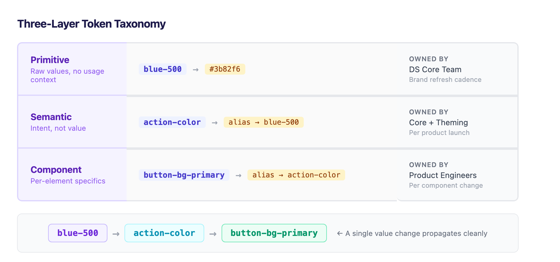
What changed is not the idea of tokens; teams have shared color variables for years. What changed is that the format became a real standard. Before the DTCG spec, every team invented its own JSON shape, naming convention, and build script. A token file from one organization was useless to another. Even internally, the Figma source and the code output drifted apart because the two sides spoke different formats.
The DTCG spec directly addresses the problems that kept tokens from traveling:
- Theming and multi-brand support: a single token file can express light mode, dark mode, and regional brand variants through nested mode definitions.
- Modern color spaces: Display P3, Oklch, and OKLAB are first-class types, not hacks on top of sRGB hex codes.
- Rich token relationships: inheritance, aliases, and composite values are modeled natively rather than as team conventions.
- Cross-platform code generation: the standard output targets iOS, Android, web CSS, and Flutter from one source.
The honest read on the 84% number: it measures teams that report using tokens in some form, not teams running a clean, governed, three-layer system end to end. Plenty of those teams have tokens in Figma and a different set of variables in code. The opportunity in 2026 is not to start using tokens (most teams already do); it is to make the token graph the single source of truth so the design and code sides cannot drift.
The Three-Layer Token Taxonomy
The most common reason token systems collapse is flattening everything into one layer (components referencing raw hex values, or a single semantic name doing the job of three). The fix is a strict three-layer taxonomy where each layer references only the layer below it.
Layer 1: Primitive Tokens
Primitive tokens hold raw values with no opinion about usage. They are the palette, the spacing scale, the type ramp, named by their value, not their role.
| Token | Value |
|---|---|
blue-500 | #3b82f6 |
space-4 | 16px |
radius-md | 8px |
gray-200 | #e5e7eb |
These are owned by the design system core team and should rarely change, typically only during brand refreshes or foundation updates. Primitives feed semantic tokens exclusively; no component ever references a primitive directly.
Layer 2: Semantic Tokens
Semantic tokens name intent rather than value. They create the abstraction layer that makes theming possible without touching components.
| Token | Value (light) | Value (dark) |
|---|---|---|
action-color | alias → blue-500 | alias → blue-400 |
surface-primary | alias → white | alias → gray-900 |
text-primary | alias → gray-900 | alias → gray-100 |
border-default | alias → gray-200 | alias → gray-700 |
When you add a dark theme, you re-point semantic tokens in a second mode. Zero components change. When a brand refresh deepens the primary blue, you edit one primitive and the entire system picks up the new value. Semantic tokens are owned by the core team plus theming owners, and they change at the rhythm of product launches, not component releases.
Layer 3: Component Tokens
Component tokens are the per-element specifics: the background color of a primary button, the padding inside a card, the border radius of an input field. Every component token aliases a semantic token, never a primitive.
| Token | Value |
|---|---|
button-bg-primary | alias → action-color |
button-text-primary | alias → text-inverse |
card-padding | alias → space-4 |
input-radius | alias → radius-md |
Component tokens are owned by component or product engineers. When a designer wants a one-off button treatment for a special promotion, it lives in a component token and never pollutes the semantic layer that the rest of the system depends on.
The alias chain reads: blue-500 → action-color → button-bg-primary. Every arrow is a relationship the DTCG spec models natively, not a documentation convention.
The Figma-to-Code Pipeline
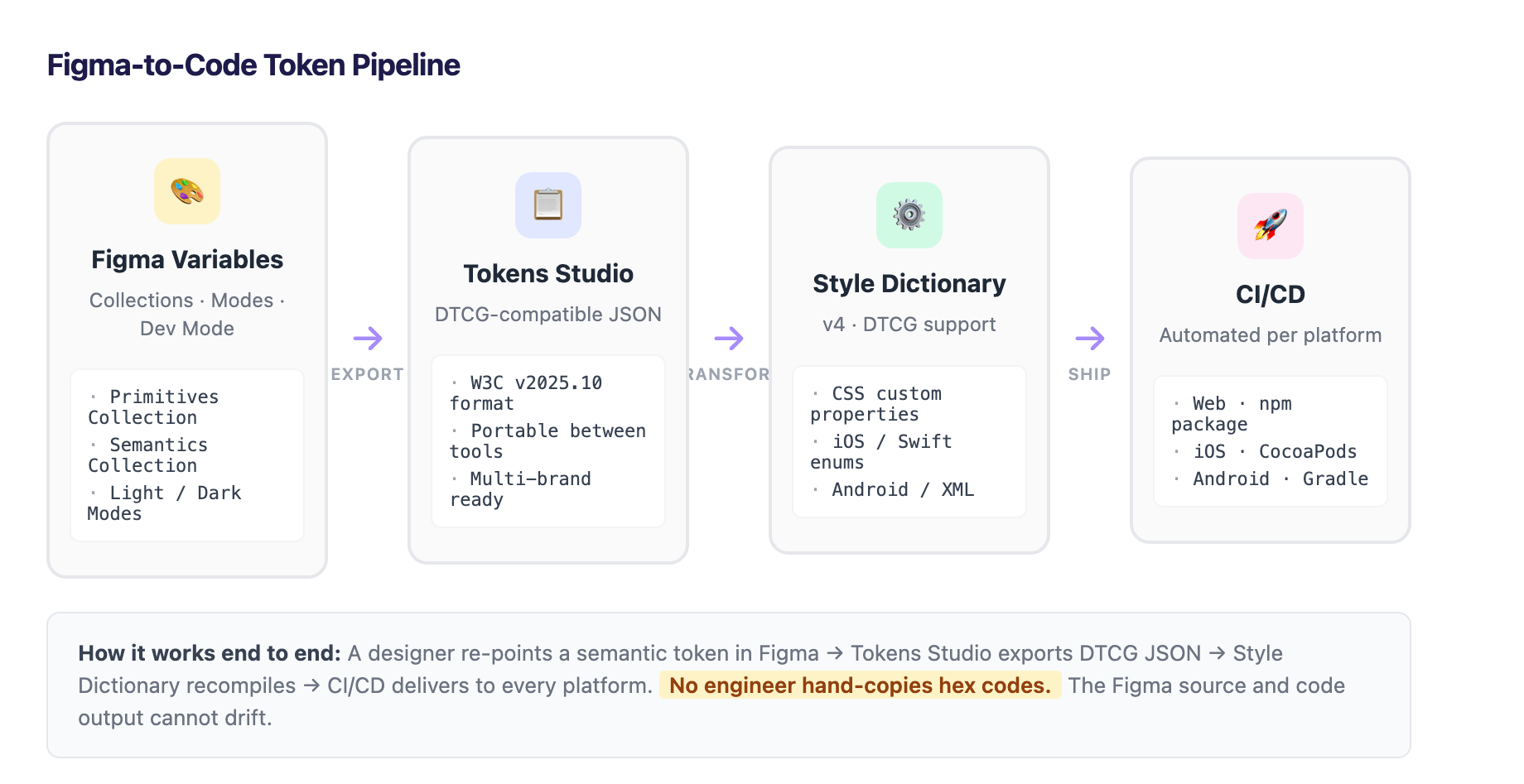
The standard makes the pipeline boring in the best way. Here is how it works end to end.
Source: Figma Variables
Tokens live in Figma Variables, organized in Collections (Primitives, Semantics, Components). Modes within each collection drive light/dark and multi-brand theming. Figma's Dev Mode exposes token names to engineers inspecting designs, so they never need to guess which hex value goes where.
Export: Tokens Studio
The Tokens Studio plugin serializes Figma variables to DTCG-compatible JSON. This is the critical bridge: because the output speaks the standard format, the export is portable rather than tool-locked. Switch design tools later? The token JSON moves with you.
Transform: Style Dictionary
Style Dictionary transforms that JSON into whatever each platform needs: CSS custom properties, Sass variables, JavaScript constants, iOS Swift enums, Android XML resources. Style Dictionary v4 added first-class DTCG support; v5 (currently in progress) brings more complete 2025.10 compatibility.
Tooling caveat: confirm the current DTCG format coverage on the Style Dictionary docs before committing a production pipeline to a specific version. The spec is new, and tooling maturity varies.
Deliver: CI/CD
CI/CD ships the transformed tokens to every platform automatically on every change. A designer re-points a semantic token in Figma, the export regenerates, Style Dictionary recompiles, and the platforms pick up the new values on the next build. No engineer hand-copies hex codes. No designer files a ticket asking why the button is still the old blue.
The Payoff
Grammarly ran an internal survey and found that their design system saved design and development teams 25% of their work week. Freshworks credited its design system with a 28% reduction in customer service costs and improved time-to-resolution on support tickets. SAP collects over a million data points from users via in-app surveys to feed back into the system, making it a board-level KPI tracked via OKRs.
Build vs. Adopt: The Middle Path
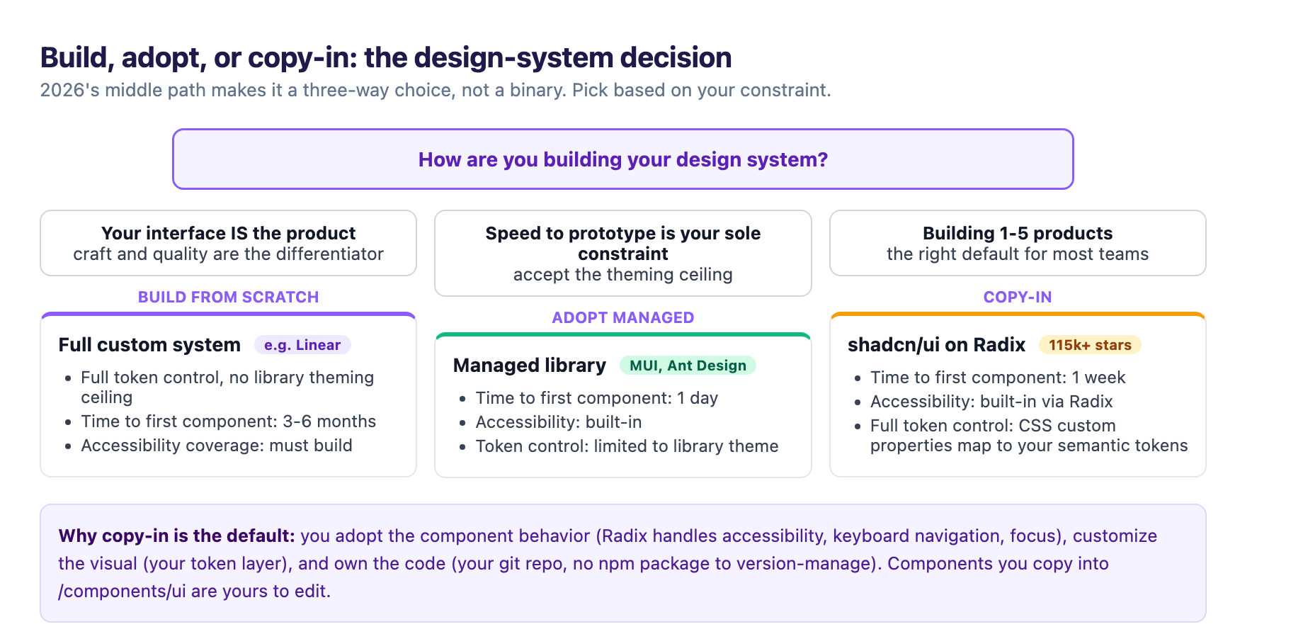
The build-versus-adopt question has historically been framed as a binary: either build everything from scratch (full control, high investment) or adopt a managed library like MUI or Ant Design (speed, lost control). In 2026, there is a well-established middle path.
The Copy-In Model
shadcn/ui (115,000+ GitHub stars as of March 2026, named the #1 most popular JavaScript project of 2024 by the JavaScript Rising Stars report) popularized a different model: components you copy into your codebase rather than install as a dependency. There is no npm package to version-manage; you run npx shadcn@latest add button, a button.tsx file lands in your /components/ui folder, and from that point it is yours. Edit it, delete lines, add variants. No workarounds, no fighting library defaults.
Why This Matters for Token Systems
shadcn/ui is built on Radix UI primitives (which handle WAI-ARIA accessibility, keyboard navigation, focus management) and styled with Tailwind CSS. The critical design choice: shadcn/ui defines its theme as CSS custom properties (token names like --primary, --radius, --background) that map directly to your semantic token layer.
This is the token-first pattern in practice:
- Define your primitive and semantic tokens in Figma Variables.
- Export via Tokens Studio → Style Dictionary → CSS custom properties.
- Wire those CSS custom properties to shadcn/ui's theme variables.
- Every shadcn/ui component (button, dialog, dropdown, card) picks up your tokens.
The result: you get production-ready, accessible components without building from scratch, while retaining full control over your brand token layer. This is the copy-in model applied to design systems: adopt the component behavior (Radix), customize the visual (your tokens), and own the code (your git repo).
The Decision Matrix
| Factor | Build from Scratch | Adopt Managed (MUI, Ant) | Copy-In (shadcn/ui + Radix) |
|---|---|---|---|
| Time to first component | 3-6 months | 1 day | 1 week |
| Accessibility coverage | Must build | Built-in | Built-in (via Radix) |
| Token control | Full | Limited to library theme | Full (CSS vars) |
| Upgrade burden | None | Library version migrations | Manual (choose when to copy) |
| Bundle size | Minimal | Large (full library) | Per-component only |
| AI tool compatibility | Manual | Poor (library abstractions) | Excellent (plain files) |
For most teams building one to five products, the copy-in model is the right default. Build from scratch only if your interface is the product (like Linear, whose design system enables its focus on craft and quality). Adopt a managed library only if speed to prototype is your sole constraint and you accept the theming ceiling.
Governance: Keeping the System Alive Past Year One
A token taxonomy and pipeline are necessary but not sufficient. Governance is where design systems live or die.
Team Model
The zeroheight report found that 55% of organizations use a centralized model (dedicated design system team), 22% use hybrid, and 19% use federated. Dedicated teams correlate strongly with adoption: 79% of organizations now have a dedicated design system team, up from 72% in 2024.
But resource constraints are real. Only 41% of small-company teams and 46% of large-company teams feel they have enough people. The model that works best in practice is centralized for the token infrastructure + federated for component contributions:
- Core team owns primitive + semantic tokens, the pipeline, and accessibility standards.
- Product teams own component tokens and contribute component variations back.
- A named owner (or rotating lead) reviews contributions against a published checklist: does it alias semantic tokens? Does it pass WCAG 2.2? Is it documented?
Accessibility at Source
This is the strongest practical argument for a design system, and the least discussed. As of 2025, 94.8% of home pages had detectable WCAG violations, and many trace to repeated component-level errors: buttons without focus indicators, modals that trap keyboard users, forms without error messages.
Fix a button once in the shared library and every screen that uses it inherits the fix. Ship a broken button to fifty teams and you have fifty bugs.
WCAG 2.2 became the required standard for the European Accessibility Act as of June 28, 2025, adding nine new success criteria beyond WCAG 2.1. Two concrete requirements to encode in your component tokens:
- Touch targets: WCAG 2.2 AA sets a 24×24 CSS pixel minimum. Apple recommends 44×44 points. Google Material Design recommends 48×48 dp. Bake the larger, friendlier target into your button component so no product team has to remember the rule.
- Focus indicators: Encode focus ring width, offset, and color in component tokens; never rely on browser defaults, which fail contrast requirements.
Automation and Regression
Storybook powers the component explorer for Shopify Polaris, IBM Carbon, Salesforce Lightning, and GitHub Primer. Pairing visual regression testing (via Chromatic) with accessibility regression testing against every pull request is how a system stops drift before it ships rather than after a customer reports it. That pairing is the subject of our visual regression testing for design systems guide.
Only about 10% of design system teams currently use AI for documentation or story generation, per the zeroheight report. Auto-generating Storybook stories from component code and drafting accessibility annotations from Figma designs are concrete, low-risk first steps that compound the same way the system itself does.
The ROI Picture
The business case for design systems has matured past "it reduces rework." The Figma DXC report The Business Value of Design Systems frames the ROI across four dimensions:
- Customer outcomes: Freshworks' 28% reduction in customer service costs, tied to design system consistency reducing support friction.
- Global scale: Hyundai Motor Group unified 30+ vehicle models across Hyundai, Kia, and Genesis brands using a shared design system, ensuring cultural resonance without sacrificing brand identity.
- Internal velocity: Grammarly's 25% work-week recovery. IBM research indicates teams with mature systems ship features 2.6× faster than teams without.
- Revenue impact: Forrester Research found companies investing in design systems see an average 8.2% improvement in conversion rates within 18 months. Case studies show 300–600% annual ROI with payback periods of 2–4 months once adoption crosses ~60%.
Getting Started: A 90-Day Playbook
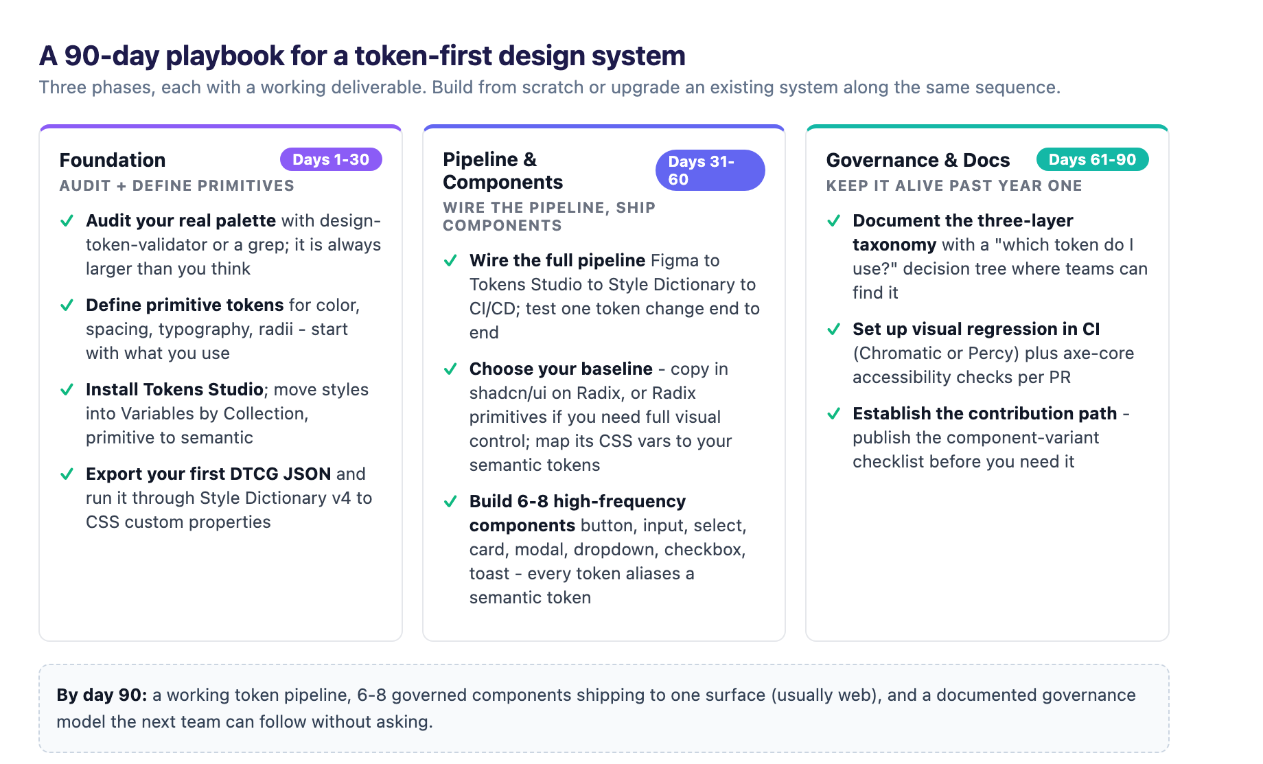
If you are building a token-first design system from scratch or upgrading an existing one, here is a practical sequence.
Days 1–30: Foundation
- Audit your current UI surface: what colors, spacing, and type values are actually in use? Tools like Design Token Validator or a simple grep over your codebase reveal the real palette, which is almost always larger than you think.
- Define primitive tokens for color, spacing, typography, and radii. Start with what you already use; do not design a hypothetical scale.
- Install Tokens Studio in Figma. Move your existing color and type styles into Variables organized by Collection → primitive → semantic.
- Export your first DTCG JSON and run it through Style Dictionary v4 to generate CSS custom properties.
Days 31–60: Pipeline and Components
- Wire the Figma → Tokens Studio → Style Dictionary → CI/CD pipeline. Test it with a single token change end to end.
- Choose your component baseline. For most teams: copy in shadcn/ui on Radix, or adopt Radix primitives directly if you need full visual control. Map shadcn's CSS custom properties to your semantic tokens.
- Build the 6–8 highest-frequency components: button, input, select, card, modal, dropdown, checkbox, toast. Every component token aliases a semantic token; no hard-coded values.
Days 61–90: Governance and Documentation
- Document the three-layer taxonomy with a clear "which token do I use?" decision tree. Publish it where teams can find it (Storybook, zeroheight, or a simple markdown page in the repo).
- Set up visual regression testing in CI (Chromatic or Percy). Add axe-core or similar for automated accessibility checks per PR.
- Establish a contribution path: what does a team need to do to add a component variant? Publish the checklist before you need it.
By day 90, you should have a working token pipeline, 6–8 governed components shipping to one surface (usually web), and a documented governance model that the next team can follow without asking.
The Next Frontier: AI and Design Tokens
The forward signal is in the 10% number. Only about one in ten design system teams currently use AI for documentation, story generation, or accessibility annotations per the zeroheight report. That is the clearest underexploited opportunity in the space.
Token-first systems are inherently AI-compatible because they separate structure from presentation. An AI tool reading your token graph can answer: what is the primary action color? What spacing scale does this card use? Generate a new button variant that respects the system. This is why v0.dev, Cursor, and Claude Code all generate shadcn/ui by default: the token-driven CSS variable architecture means the generated output is guaranteed to be on-brand.
The teams that pair a well-layered token graph with AI-assisted documentation, accessibility annotation, and story generation will compound faster than teams still treating the design system as a static asset. The infrastructure is finally standardized. The differentiator has moved up the stack to method and culture.
- DTCG Design Tokens Format Module v2025.10: w3.org
- zeroheight Design Systems Report 2025: zeroheight.com
Sources
-
Design Systems in 2026: Scale UI Without the Chaos. digitalapplied.com ↩ ↩2 ↩3
-
Design tokens explained (Contentful). contentful.com ↩
-
The new business case for design systems (Figma/DXC). figma.com ↩ ↩2
-
The Rise of shadcn/ui (2026). shadcndeck.com ↩
-
shadcn/ui vs Radix UI. vercel.com ↩
-
WebAIM Million 2025. webaim.org ↩
-
Reducing Design & Tech Debt: The Real ROI of a Design System. saasfactor.co ↩
-
Design systems and AI: Why MCP servers are the unlock (Figma). figma.com Further reading: ↩