


Design tokens crossed a threshold this year most teams noticed only in passing. Adoption hit 84% of teams in a survey of roughly 300 design professionals, up from 56% a year earlier, and the W3C Design Tokens Community Group shipped its first stable version of the format in October 202512. Tokens stopped being a convention and became a real standard, which is why our design systems guide now treats them as the foundation of any scalable UI.
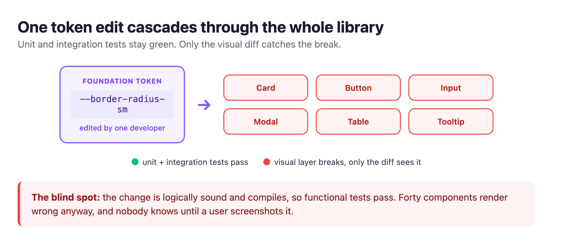
That standardization is the point, and the trap. Consistency is why tokens win, but scale breeds fragility: every shared component depends on a few foundation values. Change one border-radius token and it propagates to cards, buttons, inputs, modals, and tables, each rendering differently by container and breakpoint. And none of your existing tests will tell you3.
The token win created a blind spot
The failure mode is depressingly common. A developer pushes what looks like a harmless update: a button padding token adjusted by two pixels. It is logically sound, compiles, and every functional test is green. And it quietly misaligns every form component across the product, or shoves a modal footer over its content3.
Traditional testing is blind to this by construction. A unit test verifies behavior; an integration test verifies that components talk to each other. Neither renders the pixels, so neither sees a spacing change break the visual rhythm of forty components. The visual layer has no coverage until someone ships it and a user files a ticket with a screenshot4.
This is a direct consequence of the standardization win. When tokens were ad-hoc, the blast radius of any change was small. Now every component resolves its colors, spacing, radius, and typography from the same small set of foundation tokens, so a single edit fans out across the whole library3. The consistency you bought is what multiplies the damage of one careless change.
AI-generated UI makes the blind spot bigger
The last two years changed the bug distribution of a typical frontend, and not for the better. Cursor, Copilot, and their peers now write a meaningful share of the UI that ships, the same AI handoff we mapped in our Figma MCP design-to-code guide. The bug class that grows is specific: components that are structurally correct but visually wrong4.
A human developer building a component looks at it. They see the button is misaligned or the spacing doesn't match. The visual feedback loop is built into the process. An AI code generator has no such loop. It reasons about tokens: class names, style properties, component props. When an LLM emits padding: 12px 16px, it is producing a syntactically valid CSS rule, not placing pixels on a screen. It has no idea your design system uses an 8px spacing scale, so 12px padding puts the component out of step4.
The result is a predictable pattern. The generated code is structurally correct: imports resolve, components render, functional tests pass. But the visual output is off in ways that only surface when a human opens a browser. Wrong spacing values that are numerically valid but off-scale. Color tokens from a previous design-system version that still compile but are deprecated. Responsive breakpoints pattern-matched from a similar component instead of read from the spec. Misaligned flex children where the container props are right but the child alignment ignores the parent's styles4.
None fail a linter or throw a runtime error. All are visible the moment a user opens the page. AI writes code, not pixels, and the gap between "the code is correct" and "the page looks correct" is exactly where visual regression testing lives4.
The four-step loop, and the one human seam
Visual regression testing is straightforward. You capture screenshots of your components at a known-good state as a baseline, then compare every subsequent render against it. Any difference above a threshold triggers a diff report, and a human decides whether the change was intentional or a regression45.
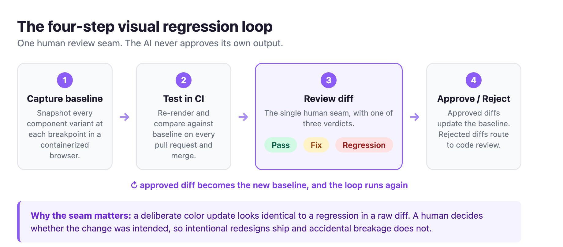
The workflow that works for design systems has exactly four steps3:
Step one: capture the baseline
The first run screenshots every component variant at the breakpoints you care about. These become your reference. Use a containerized browser so rendering stays consistent across machines and CI runners, because font rendering varies between operating systems3.
Step two: run on every change
Wire the tests into CI so they run on every pull request and merge to main. The tool re-renders each component, takes a fresh screenshot, and compares it against the baseline3.
Step three: review the diffs
Not every difference is a regression. A deliberate color update shows up as a diff but should be approved. A human reviews each in a dashboard that overlays baseline and current renders and highlights the changed regions. This is the one human seam in the loop. The reviewer renders one of three verdicts: pass, fix, or regression. The AI never approves its own output3.
Step four: approve or reject
Approved diffs update the baseline. Rejected diffs route to code review to find the root cause. Then the cycle repeats: baseline, test, diff, verdict, and back again. That loop is the heartbeat of design-system maintenance3.
Component-level coverage matters, not just full-page screenshots. For a design system you test the atomic units: buttons, cards, form fields, tooltips, badges, and their variants and states. Teams typically wire this into Storybook, rendering each story in isolation. The diff surface is smaller, the false-positive rate drops, and every variant stays verified after any upstream token change35.
The diff engine is the real decision
The capture part is easy. The diff engine is where visual testing lives or dies, because false positives are the top reason teams abandon it3.
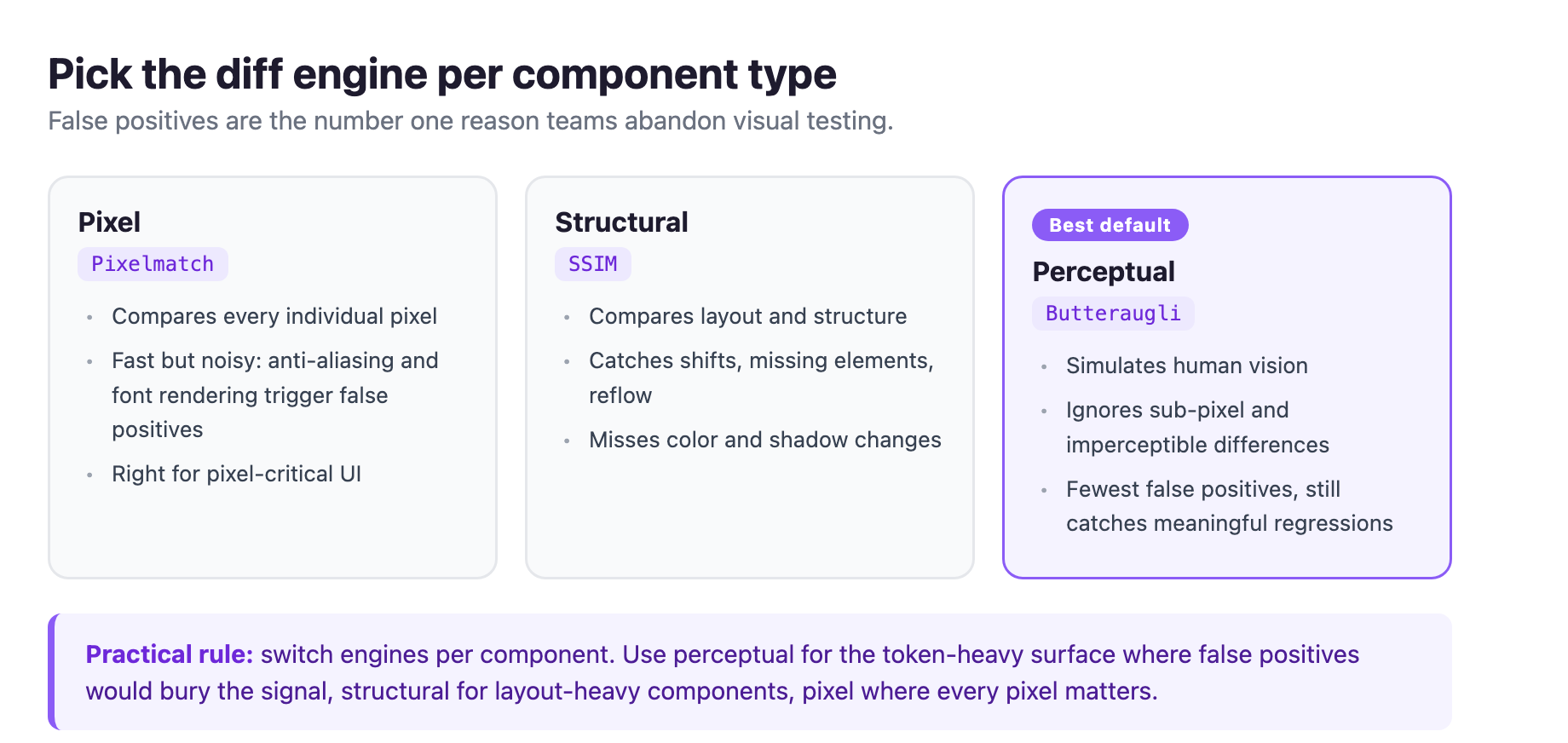
Pixel diffing, typically Pixelmatch, compares every individual pixel. It is the most granular and the noisiest. Anti-aliasing differences between operating systems, font-rendering variations, and sub-pixel positioning all trigger false positives. It suits pixel-critical UI, and it drowns routine CI runs in noise3.
Structural diffing, typically SSIM, compares element positions, dimensions, and layout properties. It catches layout shifts and reflow issues, but misses purely visual changes like a color update or shadow. Use it for layout-heavy components where positioning is the concern3.
Perceptual diffing, typically Butteraugli, simulates human vision. It ignores sub-pixel differences, anti-aliasing artifacts, and minor color variations the eye cannot detect, so it produces fewer false positives while still catching meaningful regressions. For token changes that need catching without flooding the team with noise, it is the best default3.
Choosing your tooling by scale
The tool landscape in 2026 runs from free open-source to enterprise AI platforms, and the right choice is mostly a function of your scale and existing toolchain45.
If you are not doing visual testing at all, start with Playwright's built-in toHaveScreenshot(). It costs nothing and adds no dependency if you already run Playwright for E2E, and it generates baselines automatically. The tradeoff is that you get pixel thresholds and nothing else: you handle noise manually, and an intentional redesign means a manual pass through every test file45.
If you want dedicated open-source tooling with a real workflow, BackstopJS is the battle-tested option. It is free and capable, but the setup and maintenance are on you. Budget three to five days for setup and Docker, and know manual baseline management is fine under about fifty scenarios and becomes a second job past that4.
If your components live in Storybook, Chromatic is the natural fit. It captures every story on every PR, surfaces diffs in a review UI, and handles interaction testing with Storybook's play functions. It reduces noise by design, and the workflow feels closer to design review than testing. The limitation is scope: it tests components in isolation, so it will not catch the bug where a correctly rendered button is placed wrong inside a parent page. Pair it with something page-level45.
If you are already in the BrowserStack ecosystem, Percy adds visual coverage across the same device matrix, with automatic branch-aware baseline management. Its AI Visual Review Agent, launched in late 2025, filters out about 40% of false positives and cuts review time by roughly three times5.
If you run a large QA organization with hundreds of visual tests, Applitools Eyes is the enterprise option. Its Visual AI separates layout changes from content changes and handles cross-browser rendering without false positives. In January 2026 it shipped Eyes 10.22 with a Storybook addon and a Figma plugin that lets designers compare production screenshots against their Figma designs. The cost and setup are enterprise-grade, so it does not pencil out for eight to fifteen engineers, but it does for a fifty-person QA org56.
The cost math matters before you pick a commercial tool. A 200-component design system with five variants each and three breakpoints is roughly 3,000 snapshots per baseline, and every commit runs against all of them3. Snapshot-based billing gets expensive fast. Open-source tools sidestep per-snapshot billing, and several offer data sovereignty for regulated industries where UI screenshots cannot leave your infrastructure35.
Beyond the diff: token compliance and contrast
Visual regression testing catches a broken render, but there is a subtler drift it can also surface: values that quietly stop resolving to your tokens. An automated design-token audit walks every rendered node, reads its computed color, spacing, radius, and typography, and maps each value back to the nearest token. Anything that does not resolve is flagged as off-token and ranked by severity and node count3.
This turns slow, invisible design-system erosion into a number you can watch on every build. A font-size: 10px where the scale expects 12px across 146 nodes is a different fix from a one-off 2px border radius, and the audit tells them apart by blast radius. Pair that with an automated contrast check, and a token edit that drops a component below the WCAG threshold is flagged in the same build it lands3.
The pitfalls that kill the practice
The single biggest reason teams abandon visual testing is false positives. Run the suite and it flags the loading spinner as broken every time, and soon nobody looks at the report. The fixes are known. Containerize rendering so fonts and anti-aliasing match. Mask dynamic content like timestamps and ads with ignore regions. Set sensible thresholds rather than pixel-perfect comparison. Scope assertions to elements rather than full pages so the test only fails when what you care about changed56.
There is also a deeper limit every tool shares: they are reactive. They tell you something changed, not whether it should have changed. That baseline-management problem is why intentional redesigns create bulk updates and why mixed changes demand human judgment on every diff4. Keep that human seam, do not automate away the reviewer.
Start small. Capture baselines for your core components, wire visual tests into CI, pick a tool that matches your scale and data-sovereignty needs, and let the loop run. When tokens are the standard and AI writes a growing share of the UI, the team that sees visual breakage before a user does is the one that ships design systems people trust.
Sources
-
W3C Design Tokens Community Group, "Design Tokens specification reaches first stable version" (Oct 28, 2025). w3.org ↩
-
Digital Applied, "Design Systems in 2026: Scale UI Without the Chaos" (zeroheight survey: 84% adoption, up from 56%). digitalapplied.com ↩
-
Lastest, "Visual Regression Testing for Design Systems: The 2026 Guide." lastest.cloud ↩ ↩2 ↩3 ↩4 ↩5 ↩6 ↩7 ↩8 ↩9 ↩10 ↩11 ↩12 ↩13 ↩14 ↩15 ↩16 ↩17
-
Autonoma, "Visual Regression Testing Tools Compared: 6 Options for Teams Shipping AI-Generated UI" (Apr 2026). getautonoma.com ↩ ↩2 ↩3 ↩4 ↩5 ↩6 ↩7 ↩8 ↩9 ↩10 ↩11
-
Bug0, "Best Visual Regression Testing Tools for 2026." bug0.com ↩ ↩2 ↩3 ↩4 ↩5 ↩6 ↩7 ↩8 ↩9
-
Wopee.io, "Ultimate Guide to Visual Testing" (May 2026). wopee.io ↩ ↩2