


Pick a component library today and you are not really picking a library. You are picking where in a three-layer stack you want to own the work: the primitive layer that handles behavior and accessibility, the component layer that applies styling, or both. The 2026 news is that the primitive layer has split. Radix, the default for most of the React ecosystem for years, is still everywhere, but it is no longer moving fast. Base UI is the actively maintained alternative. shadcn/ui now lets you choose which one sits underneath its components. Here is how to navigate the layers and the fork.
Why headless won
The shift is easy to miss if you came up on styled libraries. Ten years ago, if you wanted a button you imported a styled one from Bootstrap or Material UI, complete with colors and padding. Overriding it meant fighting the library. The headless approach inverts that. A headless library ships the hard part of a component, the behavior: opening and closing, keyboard navigation, focus trapping in a modal, Esc to close, arrow keys in a menu, screen reader semantics. It ships zero styling. You bring the look.1
The three layers, clearly
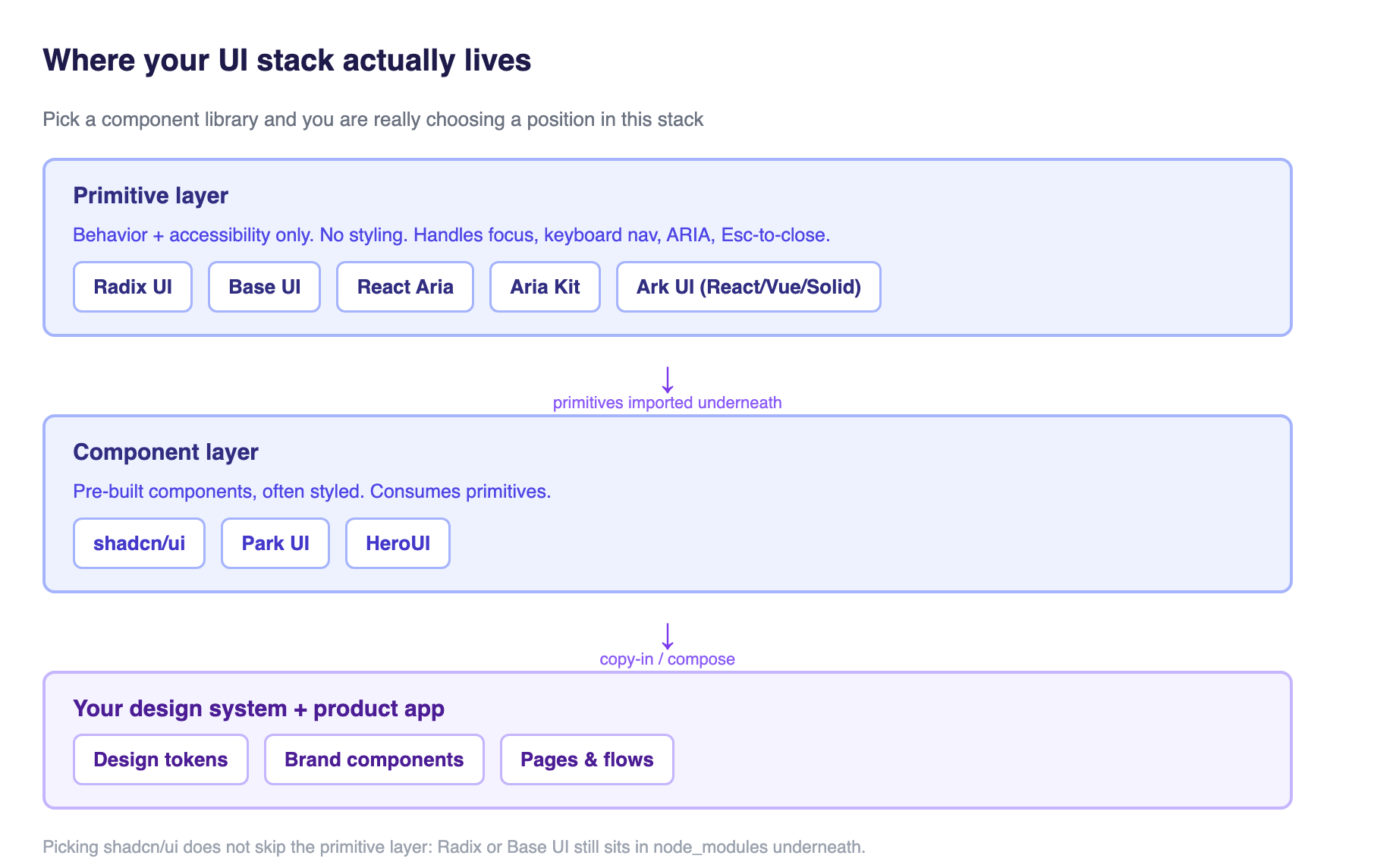
Before any comparison, get the layers straight, because most of the confusion is people comparing things at different layers and calling it a rivalry.
The primitive layer is unstyled, accessible, low-level components you compose into your own UI. Radix UI, Base UI, React Aria, and Aria Kit all live here. The component layer is pre-built combinations of primitives, often with styling applied. shadcn/ui lives here, as does Park UI and HeroUI. There is also a cross-framework primitive layer, Ark UI, that carries the same behavior logic to React, Vue, and Solid simultaneously.1
The crucial practical point: picking shadcn/ui does not let you skip the primitive layer. When you run npx shadcn add button, the styled Button source lands in your repo, but the Radix or Base UI primitives it imports still sit in node_modules underneath it. You are choosing both layers at once, whether you realize it or not.1
The primitive layer split
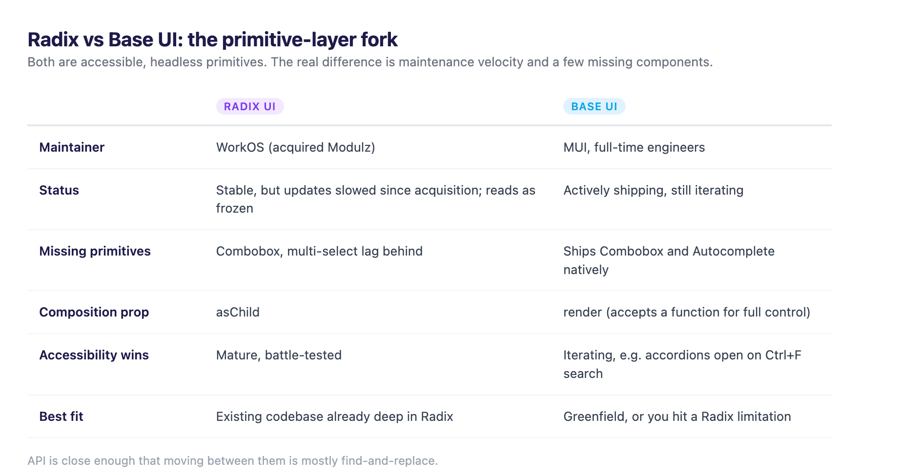
This is the actual 2026 story. Radix became the default primitive layer through most of the 2020s. It was created by the team behind Modulz, and when WorkOS acquired Modulz, Radix and its maintainers moved to WorkOS.2 In production, Radix is everywhere: the GreatFrontEnd 2026 guide calls it the original primitive library and notes its reach through shadcn/ui, with @radix-ui/react-slot alone at roughly 131M weekly downloads.1 The HeroUI 2026 roundup adds that Radix primitives are battle-tested across thousands of production applications through both direct usage and shadcn/ui.3
The catch is maintenance velocity. Since the WorkOS acquisition, updates on some of the more complex components have slowed. The commonly cited laggards are Combobox and multi-select, primitives many product teams need that Radix has not shipped at the pace teams want. In practical terms, Radix is stable, but stable has started to read as frozen.4 The HeroUI 2026 roundup puts the worry plainly: with the original Radix team's focus shifted toward Base UI, the long-term maintenance status of the Radix primitives is an open question.3
Enter Base UI. It is maintained by MUI, the Material UI company, with full-time engineers. It launched in 2024 with founding people who came from Radix, MUI, and Floating UI, which is why its API feels familiar. It ships primitives Radix does not have, notably Combobox and Autocomplete, and it keeps iterating on performance and small accessibility wins, like accordions that open when a user searches hidden text with Ctrl+F.4 The API is close enough to Radix that moving between them is mostly find-and-replace, with the one real difference being the composition prop: Radix uses asChild, Base UI uses a render prop that also accepts a function for full control.4
Then there is React Aria, which is not competing on speed at all. It is Adobe's hooks-first library, 40-plus component patterns built as hooks you compose yourself. It is the most accessibility-rigorous option in the field, the one to reach for when WAI-ARIA conformance is a contract, a government or enterprise requirement, or when you need internationalization like RTL and locale-aware dates out of the box. The cost is that you write more code per component, because you assemble the hooks yourself.1
The consumer layer: shadcn/ui is the default, with a caveat
shadcn/ui is not a library in the npm sense. It is a CLI that copies pre-built component source into your project. You run npx shadcn add button and the Button source lands in your components/ui/ folder, where you own and edit it. There is no version to bump and no breaking change to absorb from upstream. You trade dependency management for full control over the code, and you can even strip the Tailwind classes and treat the underlying primitive layer as truly headless.14
This copy-in model is why shadcn/ui overtook the ecosystem. It gives teams defaults they can fully customize because the code is theirs, accessibility is handled by the underlying Radix or Base UI primitive, and you never carry the weight of components you do not use. The honest trade-off: you own the code, so you also own the bugs. Upstream fixes require manual re-integration, and there is no central update mechanism.3
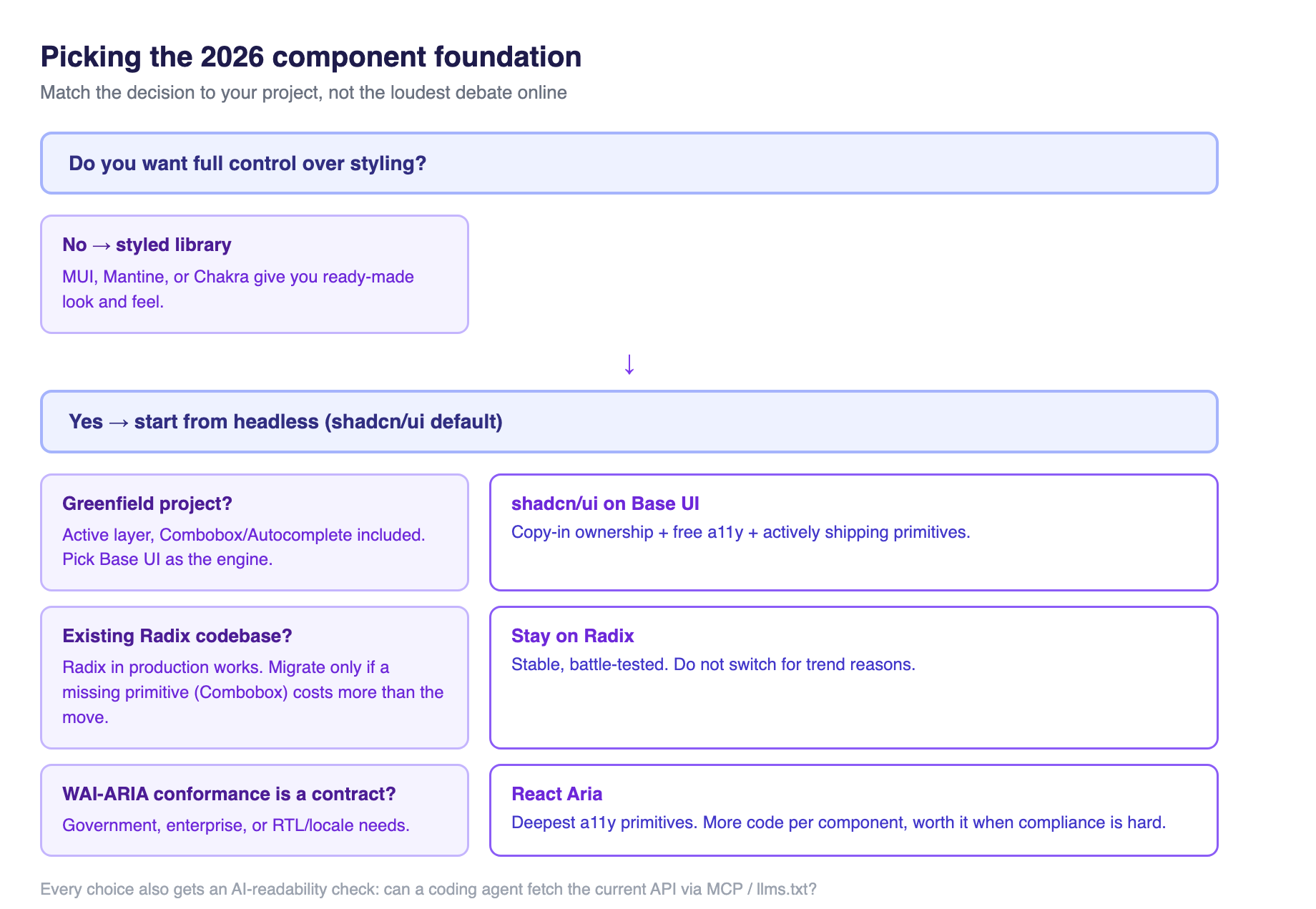
The late-2025 headline is that shadcn/ui now supports both Radix and Base UI as the underlying engine. When you start a project, you pick one. Every component was rebuilt for Base UI while keeping the same API. This is the most important decision to get right in a new design system, because it decides which primitive layer all your future components import.4
What changed for design engineering
For teams running a design system, this fork reshapes three decisions.
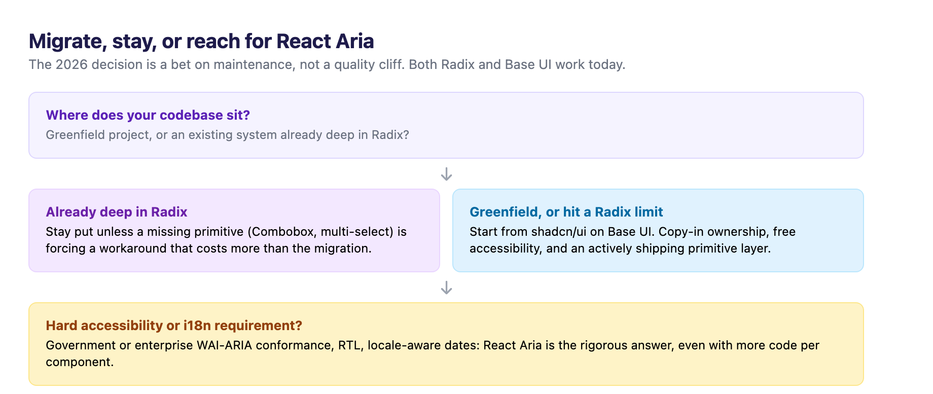
The first is the greenfield default. For a new product app where you want full design control on top of accessible primitives without writing that logic yourself, and you are already using Tailwind, shadcn/ui on Base UI is now the sensible starting point. You get the copy-in ownership model, free accessibility, and a bet on the library that is actively shipping rather than the one that has plateaued.4 The GreatFrontEnd guidance agrees: Base UI is the safer long-term pick for anyone who wants the most actively maintained primitive layer, and it is the clear answer if you have hit a Radix limitation like the missing Combobox.1
The second is the existing-codebase rule. If you are already deep in a Radix codebase, do not migrate because Base UI is trendy. Radix in production today is fine; it works, and the migration cost across a mature system is real even when the API is close. The people writing "just switch" guides are usually talking about small or greenfield projects. A mature design system should only move if a specific missing primitive, like Combobox, is forcing a workaround that costs more than the migration.4
The third is the accessibility-requirement case. If your product must meet WAI-ARIA conformance as a hard requirement, government or enterprise work, or you serve a global audience needing RTL and locale-aware components, the strongest answer is React Aria's hooks-first model, even though it means more code per component. That is the trade to make when conformance is a contract, not a nice-to-have.1
When you actually migrate
If you do move from Radix to Base UI, the path is short because the API is close. Component-by-component, swap the import path and change the composition prop from asChild to the render prop, which accepts either an element or a function for full control.4 Grep first for hand-rolled Combobox or multi-select components you built on top of Radix because it lacked them; those are exactly the primitives Base UI ships natively and the reason you are moving. Make the layer choice a written convention before components proliferate, the same governance discipline we covered in our token-first design systems piece, applied to the component layer instead of the token graph.
The AI tooling angle you cannot ignore
There is a second, quieter shift in this space that matters just as much as the Radix-versus-Base-UI fork, and it is the AI consumption layer. Component libraries are now being built to be readable by AI coding assistants, not just by humans. HeroUI ships an MCP server, an llms.txt file, and agent skills so coding tools can look up current APIs instead of guessing from stale training data. shadcn/ui publishes llms.txt, skills, and an MCP server as well, and Mantine does the same. Chakra ships an MCP server.3
This matters because it changes what "maintained" means. A library that keeps its docs machine-readable lets an AI assistant wire up current components correctly, while one that does not will produce subtly wrong code from older training data. It is the same principle as the Figma MCP design-to-code workflow: the tools your developers and designers use are becoming the ground truth agents read.5 When you evaluate a component library in 2026, add one line to your checklist: can a coding agent fetch the current API, or is it working from memory?
The pitfalls
The clearest mistake in 2026 is building a custom modal, dropdown, or combobox from scratch because you want "full control." That is the bug the whole headless movement was designed to kill. The hard part, focus management, keyboard navigation, and screen reader behavior, is solved and battle-tested. Re-solving it by hand is how accessibility regressions and weeks of edge-case work happen.4
The second mistake is treating the loud online debate as if the practical gap were large. For most teams, Radix and Base UI both produce accessible, headless primitives that work. The difference is mostly forward velocity and a few missing primitives, not a quality cliff.4 The decision is strategic, a bet on where the ecosystem is heading, not a sign your current stack is broken.
The third is ignoring the maintenance-risk read. The HeroUI roundup flags that shadcn/ui's foundation on Radix carries real uncertainty now that the original team's focus has shifted, and this is worth watching even for teams that stay put. Keep an eye on whether Base UI's velocity holds and whether Radix picks back up under WorkOS. A design system is a multi-year commitment; the primitive layer under it should be a bet you are comfortable holding.3
Where that leaves you
The 2026 component library decision is not "which button library." It is a position on the stack and a bet on maintenance. For a new project, shadcn/ui on Base UI is the defensible default: copy-in ownership, free accessibility, and an actively shipping primitive layer. For an existing Radix system, stay put unless a missing primitive is costing you more than the migration. For hard accessibility or internationalization requirements, React Aria is the rigorous answer even if it means more code. And on every choice, add the AI-readability check, because the libraries that keep their APIs machine-readable are the ones your assistants will get right.
Sources
-
GreatFrontEnd, "Top Headless UI Libraries for React in 2026." greatfrontend.com ↩ ↩2 ↩3 ↩4 ↩5 ↩6 ↩7 ↩8
-
WorkOS, "WorkOS raises $80m in Series B financing, acquires Modulz." workos.com ↩
-
Junior Garcia, "12 Best React UI Component Libraries in 2026." heroui.com ↩ ↩2 ↩3 ↩4 ↩5
-
Mohamed Idris, "shadcn vs Radix vs Base UI: Which One Should a Junior Pick in 2026?" dev.to ↩ ↩2 ↩3 ↩4 ↩5 ↩6 ↩7 ↩8 ↩9 ↩10
-
Adroit Consulting, "Design-to-Code in 2026: Context Beat Screenshots." adroit-blog-two.vercel.app ↩